Fdroid is a place for open source enthusiasts and developers to host their Free and Open Source Software (FOSS) for free and get more people onboard into their community. In order to host an app in their repository, one has to go through a several steps of builds and tests. This is to ensure that the software provided by them are as quality and safe as they can ever be. They are not allowing proprietary libraries or tools to integrate into any app or they will be published outside the Fdroid main repository (fdroid-data) so that the users will know what they are downloading.
In a normal Linux computer where we are developing Android apps and have setup Android Studio will not be able to run the build command using:
$ fdroid build -v -l org.fossasia.pslab
The reason behind this is that we have not installed gradle and build tools required by the “fdroid build” because they are not useful in our day today activities for standalone activities. First thing we need to do is, install gradle separately. This will include adding gradle to $PATH as well.
Download the latest gradle version zip file or the version your project is using with the following command. In PSLab Android app, we are using 4.5.1 version and the snippet below include that version.
Then we can add gradle to our $PATH variable using the following command:
$ export PATH=$PATH:/opt/gradle/gradle-4.5.1/bin
Now we are all set with gradle settings. Next step is to verify that the fdroid server is properly configured and up to date. When you run the build command after setting up the gradle in PC, it will throw an error similar to “failed to find any output apks”. This causes if the installed fdroid server version is old.
Fdroid server is running on python 3 and it will require some additional libraries pre-installed to properly function.
Pocket Science Lab by FOSSASIA is a compact tool that can be used for circuit analytics and debugging. To make things more interesting, this device can be accessed via the user interface using an Android app or also a desktop app. Both these apps use the UART protocol (Universal Asynchronous Receiver-Transmitter) to transmit commands to the PSLab device from mobile phone or PC and receive commands vice versa. The peculiar thing about hardware is that the developer cannot simply log data just like developing and debugging a software program. He needs some kind of an external mechanism or a tool to visualize those data packets travelling through the wires.
Figure 1: UART Interface in PSLab
PSLab has a UART interface extracted out simply for this reason and also to connect external sensors that use the UART protocol. With this, a developer who is debugging any of the Android app or the desktop app can view the command and data packets transmitted between the device and the user end application.
This requires some additional components. UART interface has two communication related pins: Rx(Receiver) and Tx(Transmitter). We will need to monitor both these pin signals for input and output data packets. It should be kept in mind that PSLab is using 3.3V signals. This voltage level is important to mention here because if someone uses 5V signals on these pins, it will damage the main IC. There are FTDI modules available in market. FTDI stands for Future Technology Devices International which is a company name and their main product is this USB transceiver chip. These chips play a major role in electronic industry due to product reliability and multiple voltage support. PSLab uses 3.3V USB Tx Rx pins and modules other than FTDI wouldn’t support it.
The module shown in Fig.2 is a FTDI module which you can simply plug in to computer and have a serial monitor interface. There are cheaper versions in shopping websites like eBay or Alibaba and they will also work fine. Both Tx and Rx pins will require two of these modules and connectivity is as follows;
This might look strange because everywhere we see a UART module is connected Rx → Tx and Tx → Rx. Notice that our idea is to monitor data packets. Not communicate with PSLab device directly. We want to see if our mobile phone Android app is sending correct commands to PSLab device or not and if PSLab device is transmitting back the expected result or not. This method helped a lot when debugging resistance measurement application in PSLab Android app.
Monitoring these UART data packets can be done simply using a serial monitor. You can either download and install some already built serial monitors or you can simply write a python script as follows which does the trick.
In PSLab android app, we have included sensor instruments which use either inbuilt sensor of smartphone or external sensor to record sensor data. For example, Lux Meter uses the light sensor to record lux data but the problem is that these instruments doesn’t contain settings option to configure the sensor record-setting like which sensor to use, change the update period etc.
Therefore, we need to create a settings page for the Lux Meter instrument which allows the user to modify the properties of the sensor instrument. For that I will use AndroidPreferenceAPIsto build a settings interface that is similar to setting activity in any other android app.
The main building block of the settings activity is the Preference object. Each preference appears as a single setting item in an activity and it corresponds to key-value pair which stores the settings in default Shared Preferences file. Every time any setting is changed by the user the Android will store the updated value of the setting in the default shared preferences which we can read in any other activity across the app.
In the following steps I will describe instruction on how to create the setting interface in Android app:
For this step, I have created a preference screen which will be inflated when the settings fragment is being created.
I created a file named “lux_meter_settings.xml” and place it in the res/xml/ directory.
The root node for the XML file must be a <PreferenceScreen> element. We have to add eachPreference within this element. Each child I added within the <PreferenceScreen> element appears as a single item in the list of settings.
The preference which I have used are:
<EdittextPreference>This preference opens up a dialog box with edit text and stores whatever value is written by the user in the edit text. I have used this preference for inputting update period and high limit of data during recording.
<CheckboxPreference> shows an item with a checkbox for a setting that is either enabled or disabled. The saved value is a boolean (true if it’s checked). I have used this preference for enabling or disabling location data with the recorded data.
<ListPreference> opens a dialog with a list of radio buttons. The saved value can be any one of the supported value types. I have used this preference to allow the user to choose between multiple sensor types.
<?xml version="1.0" encoding="utf-8"?><PreferenceScreenxmlns:android="http://schemas.android.com/apk/res/android"><EditTextPreferenceandroid:key="setting_lux_update_period"android:title="@string/update_period"android:dialogTitle="@string/update_period"android:defaultValue="1000"android:dialogMessage="Please provide time interval(in ms) at which data will be updated"android:summary="Update period is 900ms"/><EditTextPreferenceandroid:key="setting_lux_high_limit"android:title="High Limit"android:dialogTitle="High Limit"android:defaultValue="2000"android:dialogMessage="Please provide maximum limit of LUX value to be recorded"android:summary="High Limit is 2000 Lux"/><CheckBoxPreferenceandroid:defaultValue="false"android:key="include_location_sensor_data"android:summary="Include the location data in the logged file"android:title="Include Location Data" /></PreferenceScreen>
The above XML file will produce a layout as shown in Figure 1 below:
Figure 1 shows a preview of settings layout in Android Studio
Step 3 Implementing the backend of setting interface
As android Documentation clearly states:
As your app’s settings UI is built using Preference objects instead of View objects, you need to use a specialized Activity or Fragment subclass to display the list settings:
If your app supports versions of Android older than 3.0 (API level 10 and lower), you must build the activity as an extension of the PreferenceActivity class.
On Android 3.0 and later, you should instead use a traditional Activity that hosts a PreferenceFragment that displays your app settings.
Therefore, I first created an Activity named “SettingsActivity” which will act as a host for a Fragment. This gist contains code for SettingsActivity which I defined in the PSLab android app which will show the Setting Fragment.
Now, for setting fragment I have created a new fragment and name it “LuxMeterSettingsFragment” and make that fragment class extends the PreferenceFragmentCompat class and for which I needed to add this import statement.
This method is called when the Android is creating the Preferences that is when we need to call the method ‘setPreferencesFromResource()’ and pass the resource file in which we have defined our preferences along with the root key which comes as a parameter. Here, the Android will create preferences referred by the key which we have provided and initialize it to the default value in the default SharedPreferences file.
Step 4 Providing setting option to navigate to setting activity
First I included a setting option in the menu file which is getting inflated in the Lux Meter Activity toolbar as shown in below code.
Then, heading over to Lux Meter Activity in the onOptionItemSelected() method I added below code in which I created intent to open Setting Activity when the setting option is selected.
@OverridepublicbooleanonOptionsItemSelected(MenuItem item){
case R.id.settings:
Intent settingIntent = new Intent(this, SettingsActivity.class);
settingIntent.putExtra("title", "Lux Meter Settings");
startActivity(settingIntent);
break;
}
After this step, we can see the settings option in Lux Meter Activity as shown in Figure 2
Figure 2 shows the setting option in the overflow menu
To see if its working opens the app -> open Lux Meter Instrument-> Open Overflow Menu -> click on Lux Meter Setting Option to open settings.
Here we can the Lux Meter Setting as shown by the Figure 3.
Figure 3 shows the screenshot of the Lux Meter Setting activity on the actual device
Step 5 Implementing listener for change in Preferences item
Now, to register this listener with the Preference Screen which we will do it in the onResume() method of the fragment and deregister the listener in the onPause() method to correspond with the lifecycle of the fragment.
@Override
public void onResume() {
   super.onResume();

getPreferenceScreen().getSharedPreferences().registerOnSharedPreferenceChangeListener(this);
}
@Override
public void onPause() {
   super.onPause();
        getPreferenceScreen().getSharedPreferences().unregisterOnSharedPreferenceChangeListener(this);
}
Thus we have successfully implemented settings for the Lux Meter Instrument.
This blog will demonstrate how to produce different waveforms using the Wave Generator module in the PSLab android app and view them on the Oscilloscope.
The Wave Generator in PSLab android app is simple to use and has a UI which is similar to physical commodity wave generators. It is capable of producing different waveforms like sine, sawtooth and square wave.
Apparatus Required
Before getting started with the wave generator we require the following items:
Figure 1 shows the pin diagram of the PSLab device
Let me briefly explain the use of the pins that are going to be used in the Wave generator module:
S1 and S2 pins
The PSLab device contains two pins (S1, S2) which are capable of producing two independent analog waveforms (sine, sawtooth) having different frequencies and phase offset. The frequency range is from 10Hz to 5Khz.
SQR1, SQR2, SQR3 and SQR4 pin
The SQR1 pin is used for producing the square waveform and all the SQ pins can be used together to produce four different PWM signal having the same frequency. These PWM signal can have a different duty cycle and phase.
CH1, CH2 and CH3 pin
The CH pins are used by the oscilloscope in the PSLab android app to monitor waveform signals produced by the wave generator pins. They can be used together to simultaneously monitor multiple waveforms.
Setting up the Device
We need to connect the PSLab device with the mobile phone as shown in Figure 2 which can be done by following steps:
Connect a micro USB(Mini B) to the PSLab device.
Connect the other end of the micro USB cable to the OTG.
Connect the OTG to the phone.
Figure 2 shows the connection of the PSLab device with the smartphone
Producing Waveforms
Now, once the device has been properly connected to the device (which is shown at the top right corner of the app), then in the instruments page scroll down to the Wave Generator card and click on it to open the WaveGenerator activity.
Figure 3 shows the instruments containing card view to all the instruments and icon to show device status
Here you will see a screen like shown in Figure 4 containing two monitors and a controlling panel with lots of buttons. Here the Waveform panel is used to control the S1 and S2 pins whose properties are shown on the left monitor screen and the Digital panel is used to control the SQR pins whose properties are shown on the right monitor screen.
Figure 4 shows the UI of the Wave Generator Activity
For sine/sawtooth wave:
Connect the S1 pin to the CH1 pin using a connecting wire, then in the Waveform panel select the Wave1 button, choose the type of waveform(either sine or sawtooth), then click on the Freq button to change the frequency of the wave, then use the Seek bar or the up/down arrow buttons to change the value of frequency and then press the set button to set the frequency for the S1 pin as shown below:
Figure 5 The GIF shows the setting of the properties of the W1 pin in the UI
Now, click the view button at bottom right corner, this will directly open the Oscilloscope provided by the PSLab android app .
Once the oscilloscope is open, check the CH1 pin from the panel in the bottom and we can see the sine wave in the monitor shown by the screen in Figure 6 and Figure 7
Figure 6 shows the screenshot of oscilloscope showing the sine waveFigure 7 shows the screenshot of the oscilloscope showing sawtooth wave
Similarly, if you want to see two sine waves connect the S1 pin to the CH1 and connect the S2 pin to the CH2 channel , choose the wave-type for both pin, set the frequencies for both of the waves, here you can also set the phase difference between the two waves, for setting phase difference first click on Wave2 button it will enable the phase button, then click on the Phase button and set the value of phase with the help of the Seek bar.
For Square Wave
Connect the CH1 pin to the SQ1 pin, after making the connection head over to the Digital panel in the Wave Generator, ensure that the mode is selected to square, now click on the Freq button in the digital panel and set the frequency of the square wave with the help of Seek bar, then click on the Duty button and set the value of duty cycle for the square wave as shown below:
Figure 8 The GIF shows the setting of properties for producing square wave from SQ1 pin
Now, once the square wave has been set click on the view button, the oscilloscope will open then select the CH1 pin and you can see the square wave on the monitor as shown by the screen in Figure 9.
Figure 9 shows the screenshot of the square wave as shown in the oscilloscope
Thus we have produced different waveforms using PSLab wave generator module.
The Wave Generator instrument in PSLab Android app allows us to produce waveforms having different values of properties like frequency, duty, phase etc.
The range of these properties allowed by PSLab Device are :
Table showing the range of properties that can be set for waves by PSLab device
Wave Property
Range
Min
Max
Step Size
Frequency
10 Hz
5000 Hz
1 Hz
Phase
0°
360°
1°
Duty
10%
100%
10%
We can set these values using the up/down arrow buttons provided by the wave generator but the problem is that the range of values is very high and least counts are small so it is convenient to set the values using only the up and down arrow buttons.
Therefore we need something that could allow us to directly set any value of our choice while keeping the UI interactive.
The solution to this problem – “Discrete Seekbar”. It contains a slider having points at equal intervals and whose length represents the range of the values and a head that slides over the slider and is used to select a specific value from a range of values.
I have included the discrete Seekbar in Wave Generator by using a third-party library if you want to add Seekbar directly you can do that by directly using the default Seekbar widget provided by Android SDK and setting the following attribute in as shown below.
Refer to this post[2] for implementing Seekbar directly without an external library.
The reason I chose this library is that:-
It offers various implementation of different types of Seekbar like discrete and continuous.
Implementation of Seekbar is simpler and it offers various customizations like thumb color, track color, tick text etc.
In following steps I will implement the discrete Seekbar:
Step 1 Adding the dependency
For this project, I will be using an external library “IndicatorSeekbarLibrary” by Warkiz[1], for adding the dependency we need to include the following code in our build.gradle file.
For this step, we need to add the Seekbar widget using <com.warkiz.widget.IndicatorSeekBar> XML tag in our wave generator layout file to include the Seekbar in our layout as shown in the code below:
Step 3 Attaching the listener to the Seekbar in Java file
In this step we need to attach the listener to the Seekbar to record changes in the Seekbar made by the user, for this we will create a new listener with the help of onSeekBarChangeListenerinterface and attach it with the Seekbar as shown in following code
IndicatorSeekBar seekbar = (IndicatorSeekBar) findViewbyId(R.id.seekbar);
seekBar.setOnSeekChangeListener(new OnSeekChangeListener() {
@OverridepublicvoidonSeeking(SeekParams seekParams){
/* called when the user is sliding the thumb */
}
@OverridepublicvoidonStartTrackingTouch(IndicatorSeekBar seekBar){
/* called when the sliding of thumb is started */
}
@OverridepublicvoidonStopTrackingTouch(IndicatorSeekBar seekBar){
/* called when the sliding of thumb stops */
}
});
After following all the above steps, I implemented the Seekbar shown in Figure 2 below in my wave generator and now it becomes really easy to set different values of properties for without having to continually press the up/down button.
Figure 2 shows the Seekbar included in wave generator beside up/down arrow button
In the previous blog Creating Instruction Guide using Bottomsheet, I have created the Bottom Sheet guide in instrument activities in PSLab Android app. But simply adding the Bottom Sheet in the layout is not enough as it could lead to some UI issues like no proper way to show or hide the Bottom Sheet, therefore, he/she will find it difficult to work with Bottom Sheet that could degrade User Experience.
We need to make the Bottom Sheet responsive and interactive which we can do by capturing swipe gestures done by the user and overriding their functionality i.e. when the user slides up with the finger then the Bottom Sheet will reveal itself and when the user slides the finger down the Bottom Sheet will hide.
For this Android provides a class GestureDetector which is used with another class SimpleOnGestureListener which acts as a listener to capture Gesture events like swipe, pinch, scroll, long press etc.
In this blog, I will create a custom gesture listener that will listen to the swipe events and according to the gestures it will show/hide the Bottom Sheet.
I will start by creating a gesture listener class called “SwipeGestureListener” extending the class ‘GestureDetector.SimpleOnGestureListener’ and also as I need swipe gestures to control the Bottom Sheet, so I will pass the reference of the Bottom Sheet as a parameter in the constructor.
public classSwipeGestureListenerextendsGestureDetector.SimpleOnGestureListener{
privateBottomSheetBehavior bottomSheet;
public SwipeGestureDetector(BottomSheetBehavior bt) {
bottomSheet = bt;
}
}
Now in this listener class as we are concerned with the swipe events so will only override the below method provided by ‘GestureDetector.SimpleOnGestureListener’ interface
This method is called whenever the user swipes its finger in any direction.
In the above code, we can see that the method provides with object e1 and e2 of type MotionEvent. TheMotionEvent class is used to report movements in terms of Action Codes like ACTION_DOWN, ACTION_UP and also contains other information about the touch like the pressure of the touch, x and y coordinate, orientation of the contact area etc.
The e1 object will have the attribute values relating to the point when the swipe started and the e2 object will have attribute values relating to the point when the swipe has ended.
Now, the main thing we need to determine if the direction of the swipe which is not directly available using the MotionEvent object.
So, to determine the direction of the swipe I will fetch the coordinates of the initial point and terminal point of the swipe using the objects initial and final point i.e., e1 and e2.
//Initial Point
float x1 = e1.getX(), y1 = e1.getY();

//Final Point
float x2 = e2.getX(), y2 = e2.getY();
Then, using these coordinates to calculate the angle of the swipe and based on the angle I will return the direction of the swipe as shown in the code below
As of now, I have the direction of the swipe so I will apply switch case and handle the swipe up and swipe down gesture as below:
When the user slides up:- Show the Bottom Sheet by changing the state of the Bottom Sheet from STATE_HIDDEN to STATE_COLLAPSED(partially viewable).
When the user slides down: – Hide the Bottom Sheet by changing the state of the Bottom Sheet to STATE_HIDDEN.
For doing this, we will modify the ‘onFIing()’ method as shown below
@OverridepublicbooleanonFling(MotionEvent e1, MotionEvent e2, float velocityX, float velocityY){
switch (getDirection(e1.getX(), e1.getY(), e2.getX(), e2.getY())) {
case TOP:
bottomSheet.setState(BottomSheetBehavior.STATE_COLLAPSED);
returntrue;
case LEFT:
returntrue;
case DOWN:
if(bottomSheet.getState()==BottomSheetBehavior.STATE_COLLAPSED){
bottomSheet.setState(BottomSheetBehavior.STATE_HIDDEN);
}
returntrue;
case RIGHT:
returntrue;
default:
returnfalse;
}
}
Now, the custom gesture listener is implemented but it cannot start listening to the touch event on its own, so we need to resolve this by performing the following steps:
Firstly, we need to create an object of class GestureDetector and pass the current activity context and the object of class ‘SwipeGestureListener’ as parameters. Also while creating the listener for ‘SwipeGestureListener’ we need to pass the object of the Bottom Sheet in it as a parameter.
GestureDetector gestureDetector = new GestureDetector(this, new SwipeGestureListener(bottomSheetBehavior));
Then we need to override the ‘onTouchEvent()’ method of our Activity and pass the event which is received as a parameter to the GestureDetector. Doing this will pass the touch event that it received to the GestureDetector for it to handle.
The Pocket Science Lab Android app has various functionalities which have been already implemented but it been on the verge of development, many functionalities are yet to be implemented completely, one such functionality is how the users report the issues of the app, to which comes the idea of using a Google form inside the app for the users to fill it and the issue get directly opened in Github.
Submitting a Github issue through a Google forms requires two things:-
A Github access token which gives access to open a new issue.
To generate a Github access token one must follow these steps[2]
Go to the personal settings.
Select Developers settings option from it.
In Developers settings option Go to personal access tokens and generate an access token.
A fully-structured Google form which has all the details about the issue i.e the title of the issue, the body of the issue, label, etc..
Using a Google account create a Google Form which have all the relevant questions about that issue such as title of the issue, body of the issue, label etc..
Once done with all the steps follow these steps to send a Github issue[1]
Click the Responses tab, in it click the More icon.
Select Choose a response destination.
Select New spreadsheet: Creates a new spreadsheet in Google Sheets for responses.
Click Create to create and open the sheet.
Configure the App Script Logic[1]
You should have a newly created blank spreadsheet with headers automatically generated from your form.
Click Tools > Script editor… to launch the App Script editor coding environment. This Script will be bound to your sheet, so you can listen for form submissions and fire off a new issue to your GitHub repo.
In the script editor write the following code
function onFormSubmit(e) {
vartitle = e.values[1];
var body = e.values[2];
varlabel = "User opened issue"var payload = {
"title": title,
"body": a_body,
"label": label,
};
var options = {
"method": "POST",
"contentType": "application/json",
"payload": JSON.stringify(payload)
};
var response = UrlFetchApp.fetch("https://api.github.com/repos/abhinavraj23/AgeGroup/issues?access_token="+ghToken, options)
}
Note:The onFormSubmit function includes an event object e, which includes the form/spreadsheet field values as a simple array with values in the same order as they appear in the spreadsheet. e.values[0] is the first spreadsheet column
The following google-app script uses GitHub Issues API for posting a new issue in Github.
4.Give your app script project a name and save it .
Set up the Trigger[1]
From within the app script editor, click Resources > Current project’s triggers.
Click to add a trigger
Run: onFormSubmit
Events: From spreadsheet, On form submit
Click Save and accept any authorizations to access your forms and access web services on your behalf.
This trigger will listen to form submissions and pass the data to your function, which POSTs the new issue to your GitHub repo.
Thus using these steps one can submit an issue in github through a Google Form and thus the Google Forms can be used in the app as the users can send the issues using a google form, and through this method one can also get the email-id of the user for further contact and thus this is a very useful method.
The PSLab android app consists of different instruments like oscilloscope, multimeter, wave generator etc and each instrument has different functionality and usage so it is necessary that there should be an instruction guide for every instrument so that the user can easily read the instruction to understand the functionality of the instrument.
In this we will create an instruction guide for the Wave Generator which will contain information about the instrument, it’s functionalities, steps for how to use the instrument.
The main component that I used to create instruction guide is Bottom Sheet. Bottom Sheet is introduced in Android Support v23.2 . It is a special UI widget which slide up from the bottom of the screen and it can be used to reveal some extra information that we cannot show on the main layout like bottom menus, instructions etc.
They are of two types :
Modal Bottom Sheet:– This Bottom Sheet has properties very similar to normal dialogs present in Android like elevation only difference is that they pop up from the bottom of screen with proper animation and they are implemented using BottomSheetDialogFragment Class.
Persistent Bottom Sheet:– This Bottom Sheet is included as a part of the layout and they can be slid up and down to reveal extra information. They are implemented using BottomSheetBehaviour Class.
For my project, I used persistent Bottom Sheet as modal Bottom Sheet can’t be slid up and down by the swipe of the finger whereas persistent Bottom Sheet can be slid up and down and can be hidden by swipe features.
Implementing the Bottom Sheet
Step 1: Adding the Dependency
To start using Bottom Sheet we have to add the dependency (We have also include Jake Wharton-Butterknife library for view binding but it is optional.)
In this step, we will create the layout of the Bottom Sheet, as our purpose of making Bottom Sheet is to show extra information regarding the instrument so we will include ImageView and TextView inside the layout that will be used to show the content later.
Some attributes in the layout worth noting are:
app:layout_behavior: This attribute makes the layout act as Bottom Sheet.
app:behavior_peekHeight: This is the height of the Bottom Sheet when it is minimized.
app:behavior_hideable: Defines if the Bottom Sheet can be hidden by swiping it down.
Here, we will also create one extra LinearLayout having height equal to the peek_height. This LinearLayout will be at the top of the BottomSheet as shown in Figure 1 and it will be visible when the BottomSheet is in a minimized state(not hidden). Here we will put text view with like “Show guide” and an arrow pointing upwards so that it is easier for the user to understand that sheet can be viewed by sliding up.
Figure 1 LinearLayout containing textview and imageview
Here is the gist[2] that contains code for the layout of the Bottom Sheet guide
After this step, we can see a layout of Bottom Sheet in our Android Editor as shown in Figure 2
Figure 2 shows the layout of the Bottom Sheet
Step 3: Creating the Container view layout containing content and Bottom Sheet
For container view, we will create new layout under Res⇒Layout and name it “container_view_wavegenerator.xml”
In this layout, we will use ‘Coordinator Layout’ as ViewGroup because persistent Bottom Sheet is implemented using BottomSheetBehavior class which can only be applied to the child of ‘CoordinatorLayout’.
Then add the main layout of our instrument and the layout of the Bottom Sheet inside this layout as its child.
Step 4: Setting Up Bottom Sheet and Handling callbacks
Now we will head over to the “WaveGenerator.java” file(or any instrument java file). Here we will handle set up Bottom Sheet and handle callbacks by using following classes:
BottomSheetBehavior provides callbacks and makes the Bottom Sheet work with CoordinatorLayout.
This method is called when the Bottom Sheet slides up and down on the screen. It has slideOffset as a parameter whose value varies from -1.0 to 0.0 when the Bottom Sheet comes from the hidden state to collapsed and 0.0 to 1.0 when it goes from collapsed state to expanded state.
publicvoid onStateChanged(@NonNull View bottomSheet, int newState)
This method is called when BottomSheet changed its state. Here, let us also understand the different states which can be attained by the Bottom Sheet:
BottomSheetBehavior.STATE_EXPANDED : When the Bottom Sheet is fully expanded showing all the content.
BottomSheetBehavior.STATE_HIDDEN : When the Bottom Sheet is hidden at the bottom of the layout.
BottomSheetBehavior.STATE_COLLAPSED : When the Bottom Sheet is in a collapsed state that is only the peek_height view part of the layout is visible.
BottomSheetBehavior.STATE_DRAGGING : When the Bottom Sheet is dragging.
BottomSheetBehavior.STATE_SETTLING : When the Bottom Sheet is settling either at expanded height or at collapsed height.
We will implement these methods in our instrument class, and also put the content that needs to be put inside the Bottom Sheet.
In the blog Creating the onScreen Monitor Using CardView I had created the monitors to view the wave properties in this blog we will create the UI of controlling panel that will be used for that monitors with multiple buttons for both analog and digital waveforms.
Which layout to choose?
In today’s world, there are millions of Android devices present with different screen sizes and densities and the major concern of an Android developer is to make the layout that fits all the devices and this task is really difficult to handle with a linear or relative layout with fixed dimensions.
To create a complex layout with lots of views inside the parent using linear layout we have to make use of the attribute layout_weight for their proper stretching and positioning, but such a complex layout require a lot of nesting of weights and android tries to avoid it by giving a warning :
Nested Weights are bad for performance
This is because layout_weight attribute requires a widget to be measured twice[1]. When a LinearLayout with non-zero weights is nested inside another LinearLayout with non-zero weights, then the number of measurements increases exponentially.
So, to overcome this issue we will make use of special type of layout “Constraint Layout” which was introduced in Google I/O 2016.
Features of Constraint Layout:-
It is similar to Relative Layout as all views are laid out according to their relationship with the sibling, but it is more flexible than Relative Layout.
It helps to flatten the view hierarchy for complex layouts.
This layout is created with the help of powerful tool provided by Android which has a palette on the left-hand side from where we can drag and drop the different widgets like TextView, ImageView, Buttons etc. and on the right-hand side it provides options for positioning, setting margins and other styling option like setting color, change text style etc.
It automatically adjusts the layout according to the screen size and hence doesn’t require the use of layout_weight attribute.
In following steps, I will create the controlling panel for Wave generator which is a complex layout with lots of buttons with the help of constraint layout.
Step 1: Add the dependency of the Constraint Layout in the Project
To use Constraint layout add the following to your build.gradle file and sync the project
Guidelines[3] are anchors that won’t be displayed in your app, they are like one line of a grid above your layout and can be used to attach or constraint your widgets to it. They are only visible on your blueprint or preview editor. These will help to position and constraint the UI components on the screen easily.
For adding guidelines :
As shown in Figure 1 Right-click anywhere on the layout -> Select helpers -> Select horizontal or vertical guideline according to your need.
Figure 1 shows the horizontal guideline being added to the layout.
And for positioning the guideline we have to set the value of attribute layout_constraintGuide_percent
Let’s say we want the guideline to be at the middle of the screen so we’ll set :
app:layout_constraintGuide_percent=”0.50″
For my layout I have added three guideline :
One horizontal guideline at 50%
Two vertical guidelines at 30% and 65%
Doing this will bifurcate the screen into six square blocks as shown in below figure :
Figure 2 shows the blueprint of constraint layout containing two vertical and one horizontal guidelines with their percentage offset from respective bases
Step 3: Adding the buttons in the blocks
Until now we have created six squares blocks, now we have to put a button view in each of the boxes.
First drag and drop button view from the Palette (shown in Figure 3) on the left side inside the box. Figure 3 shows the layout editor palette
Then we have to set constraints of this button by clicking on the small circle present on the middle of edges and dragging it onto the side of the block facing it. Figure 4 shows the button widget getting constrained to sides
Set the layout_width and layout_height attribute of the button to be “0dp”, doing this the button will expand in all the direction occupying all the space with respect to the border it has been constrained with.
Figure 6 shows the button widget expanding to all the available space in the box
Similarly, adding buttons in all the square blocks and providing proper theme color we will have a blueprint and layout as shown in Figure 6.
Figure 6 shows the waveform panel blueprint and actual layout for analog waves with six buttons
Following the same steps until now, I have created the other controlling panel layout having buttons for digital waves as shown in Figure 7
Figure 7 shows other constraint layout for digital waves having seven buttons
Detailing and combining the panels to form Complete UI
After adding both the panels we have created in this layout inside the Wave Generator we have the layout as shown in Figure 8
Figure 8 shows the UI of Wave Generator as shown by a actual Android device in the PSLab app.
As we can see on adding the panels the button created inside the layout shrink so as to adapt to the screen and giving out a beautiful button-like appearance.
In this blog, we will create the monitor screen in the PSLab Android app using Android studio.
Deciding the layout to use for monitors
As monitors with rounded border look appealing on android device screen so we will select CardView to be the base layout of our monitors. The CardView element allows us to add certain properties like rounded corners, elevation etc.
To use the CardView in your app, add the following dependency to build.gradle file and sync the project.
Add the <android.support.v7.widget.CardView> widget to your layout and all the other views to be shown on monitor screen will be placed inside this card layout as its child layout.
Creating the monitor cards
We need to decide how much spacing is to be provided to the cards to properly view them on different screens. Here we make use of the special attribute in the View class.
android:layout_weight=1
This attribute assigns an “importance” value to a View in terms of how much space it should occupy on the screen. That is if we give equal weight to two views which inside the same parent then they will both occupy equal space.
To implement this create two CardViews inside <LinearLayout> with the same layout_weight.
So this will give us a screen like this with equally weighted monitor card views as shown in Figure 1.
Figure 1 shows two CardView with equal weights(w/2) and equal width
Both the cards have the width equal to half the screen width which is set automatically by the Android.
Creating partitions in the monitors
We have to make partitions in the monitor screen so that every characteristic of Wave Generator like wave frequency, phase, selected pin etc. can be viewed simultaneously on the screen with proper spacing.
For making partitions we need to make a separator line which we can create by using <View> and setting the attributes as below:
This will create a thin line having the grey color. We have to make four partitions of the card view for both monitors as shown in Figure 2.
Figure 2 shows two monitors with line separator making partitions
Populating the screen with text and image icons
We have to include the <TextView> and <ImageView> to show the property data on the monitors.
Figure 3 shows partitions in the monitor CardView
Different partitions as shown in Figure 3 can be used for showing different data such as:
Top Partition:- To view the selected wave.
Left Partition:- To view the selected waveform eg:- sine, triangular
Right Partition:- To view the selected wave characteristics like frequency, phase etc.
Bottom Partition:- To view the property selected which has been selected by user
After inserting all the desired Views and providing the Views with dummy data and icons and customizing the Views by giving proper color and spacing finally we will have a layout as shown in Figure 4.
Figure 4 shows ImageView and TextView showing different dummy data
In Figure 4, the left CardView shows all the properties for the Analog Wave Generator and the right CardView shows all the properties for Digital Wave Generator.
All the characteristics on the monitors can be controlled by the controlling panel which is work in progress.


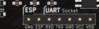 Figure 1: UART Interface in PSLab
 Figure 2: FTDI Module from


